
Airtours
A new visual language and a proper overhaul of the external communication.
Airtours is, or was, a privately owned Swedish charter operator, these days part of Sunweb Group. I worked together with the company’s own UX designer, partly to give the digital channels a proper visual freshening-up and partly to improve parts of how the analogue communication looked (ads, mailings and so on).
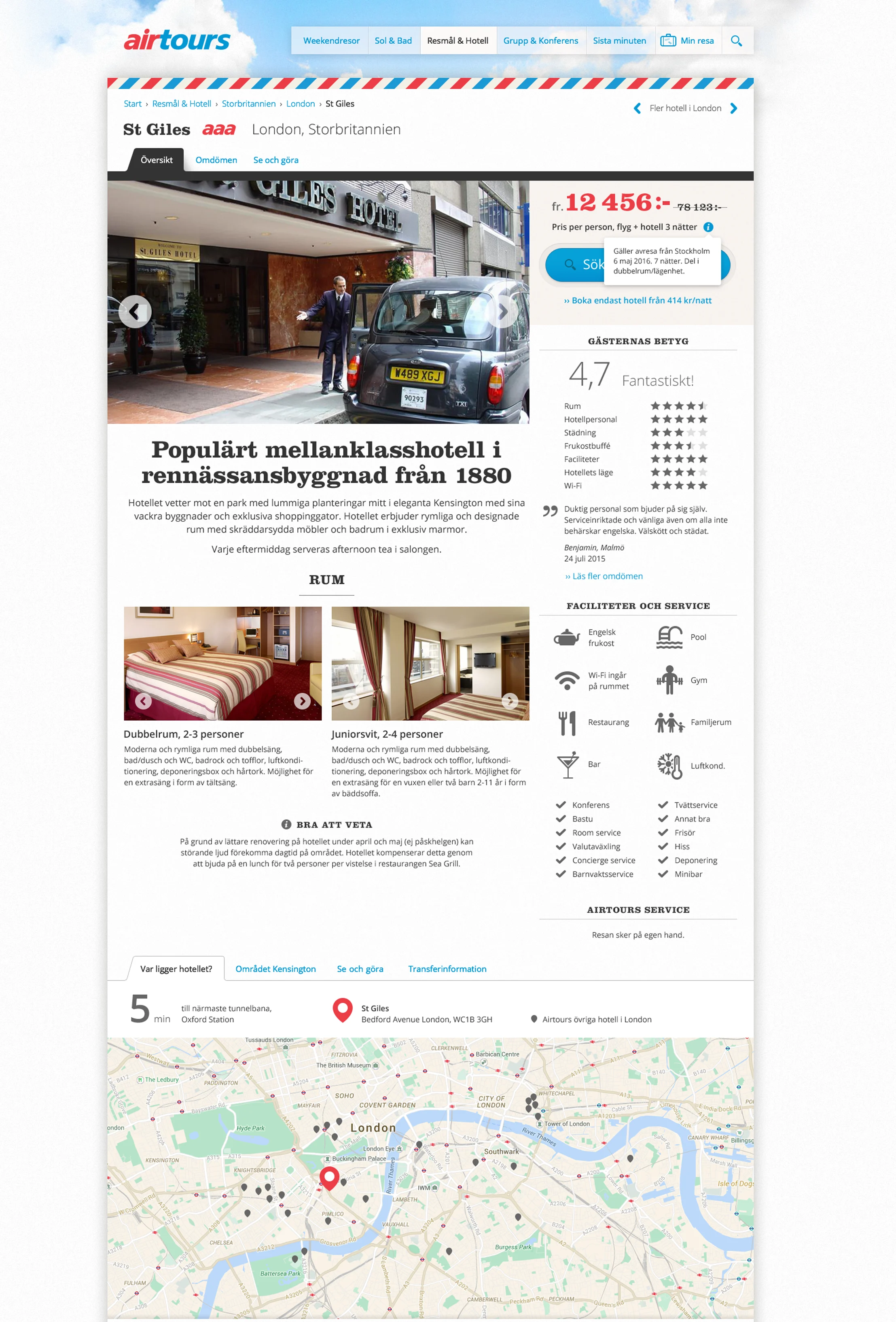
An overhaul of airtours.se from top to toe
The interface work was redone from the ground up. New homepage, new “supersök”, new category pages, new mobile views. The goal throughout was to keep the brand’s established warmth — the luggage tag, the airmail pattern and the analogue feel — without losing a modern feel in the navigation and the use of the digital services.
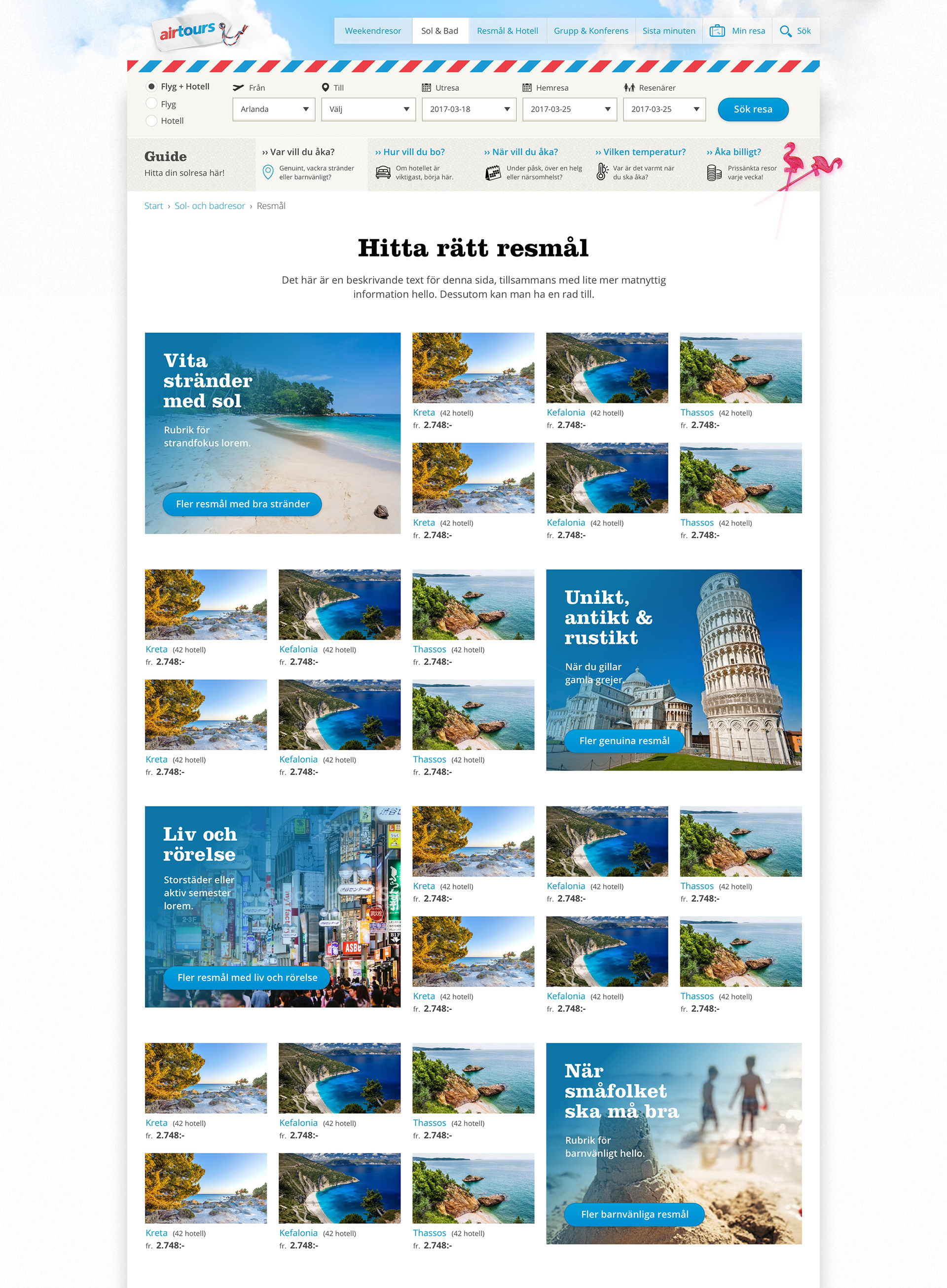
Editorial blocks inside the destination grid
Category pages like “Hitta rätt resmål” used to be flat lists of destinations. The redesign breaks them up with editorial tiles — “Vita stränder med sol”, “Unikt, antikt & rustikt”, “Liv och rörelse” — so the grid reads more like a magazine spread than a spreadsheet of hotels.
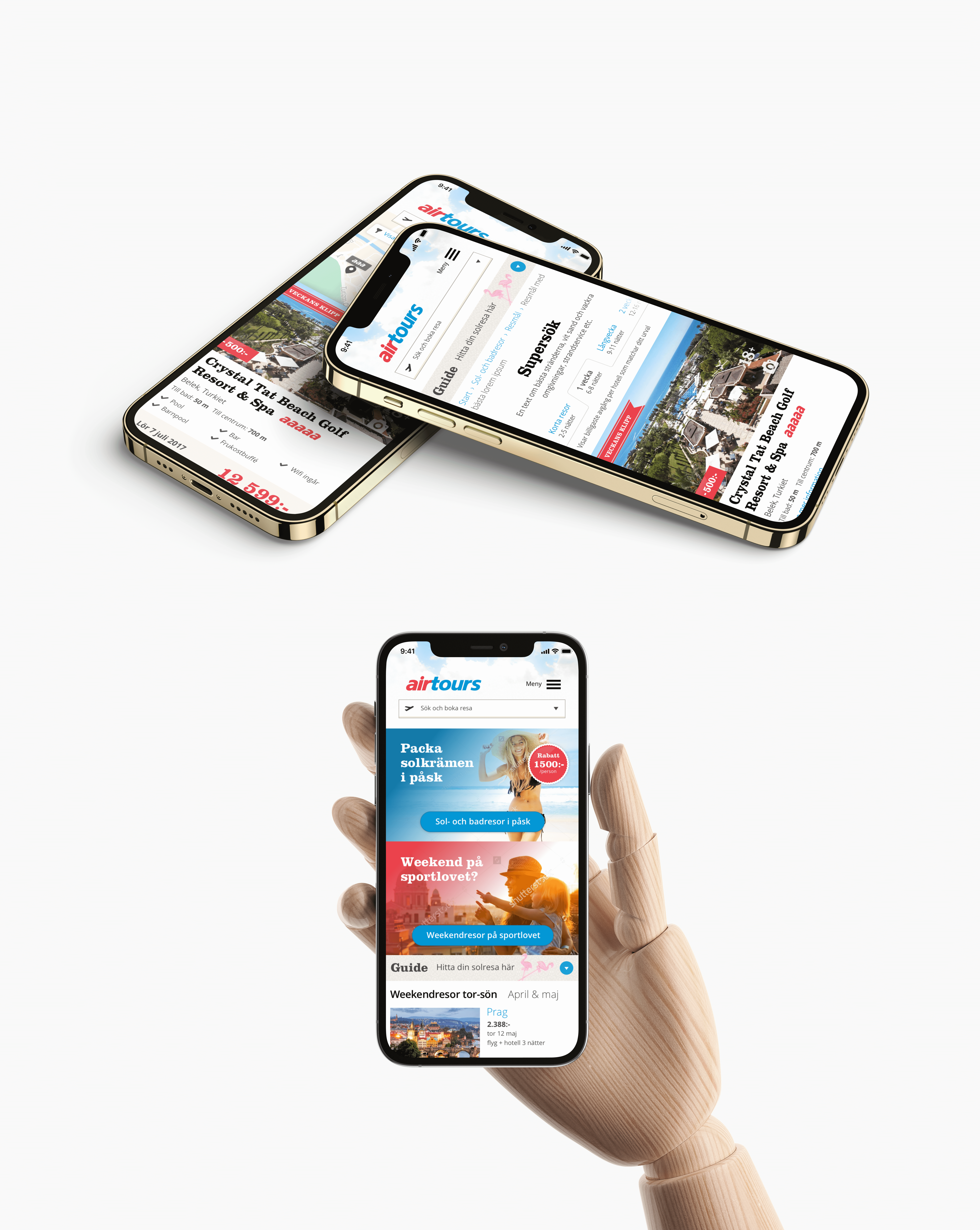
Same brand, one thumb

Softening the edges of a twenty-year-old travel brand
Alongside the interface work, a lighter update of the brand: the recurring devices Airtours uses everywhere — the discount stamp, the polaroid frames, the price labels and the full-page ads in the daily press. The logotype was left alone. This was about everything around it.
Old design vs. revised
The discount stamp got a rounder, slightly softer die-cut and a more tactile paper texture. The polaroid frame replaced the old “pinned photo” device — warmer, more scrapbook, easier to compose with. Small moves, but they set the tone for everything else.


Newspaper ads, before and after
Airtours runs a steady stream of print ads in Swedish dailies — small banners and the occasional full spread. I rebuilt the templates around the new photographic direction, the updated stamps and a more confident type hierarchy. Same airmail frame, same luggage tag, just less shouty.
